Igor Stefanov
CEO @ SRG CRO & A Kingsman @ ACROSS Global™
The sun rises soon after the rooster crows. What is the rooster in this case? Is the rooster a source of risk or just a key risk indicator? Is there a risk that sun will not rise, once the rooster doesn’t crow?
With the introduction of RBM the era of simple graphs and pie charts is over. Risk analysis requires a different approach to visualizations. Sponsors and CROs should make risk visualizations an integral part of their risk assessment and control. Proper risk visualization is all about identifying and evaluating study risks in the most intuitive way.
However, this is not yet a standard approach in the industry. Most companies are still analyzing study risks in a traditional, old fashioned way using Excel spreadsheets, pie charts and simple graphs.
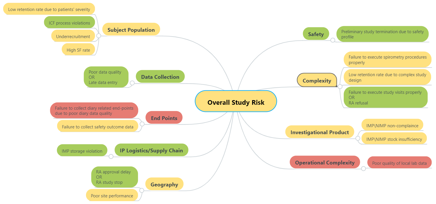
Map Expert’s Mind
ICH Q9 (Quality Risk Management) suggests an impressive list of risk management tools you can choose from. In my humble opinion, the ideal risk assessment tool is anything but a formalized way of expert thinking. Mind mapping is the best way to capture human thoughts and present them in the most intuitive visual way.
I’d recommend to start with the standard TransCelerate RACT spreadsheet and then present the results using any free online mind mapping tool. The result will be twofold: firstly, you’ll see the bigger picture and secondly, you’ll probably find certain discrepancies between the categories, as we did (see the sample below). This is similar to the on-site vs centralized monitoring, sometimes you miss the forest by focusing on the trees.
We had to rethink our approach again…
If we have agreed upon clinical trial risk definition as being ‘’the effect of uncertainty on a study objectives”, our mind map must be a directed diagram starting at causes on the left and ending at effects on the right with all potential risks clustered in the middle (read more about this in How We Failed to Implement Risk Based Monitoring).
Ishikawa’s fishbone seems to be a perfect fit. Moreover, it’s also recommended by ICH Q9 as a risk management facilitation method. According to ISO31000:2018, an event can have one or more occurrences, and can have several causes and several consequences. Ishikawa’s fishbone diagram becomes a bowtie diagram.
Rooster’s Bowtie
To stay focused I won’t waste your time with a step-by-step diagram building logic but instead present the final version below:
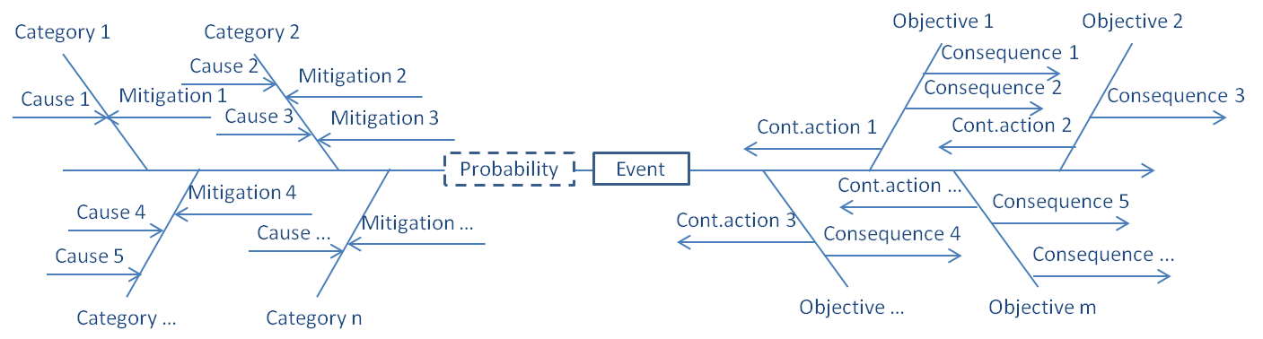
Causes can be grouped into categories depending on their nature or whatever analytics you decide to choose, e.g. TransCelerate categories. Consequences are tied to the respecting objectives (e.g. patient safety, data integrity and compliance or speed, cost and quality).
Note that both causes and consequences are directed from left to right, increasing the probability and impact, accordingly. Mitigation and contingency actions on the other hand work in the opposite direction, namely rigt to left, thus decreasing the risk and decreasing the impact.
This visualization also allows to prioritize causes, consequences, mitigations and contingency actions. The closer to the backbone, the more influential these factors.
Once such a diagram is built upon a reasonable mathematical model, it becomes the perfect tool for an effective dialogue between Sponsors and CROs during the critical study risk assessment phase.
Risk picture worth a thousand spreadsheets.
The question is, can we build such a picture?